Building a Brand by Design

These days a lot of my work centres on innovation, change and business consulting, but from time to time I get the chance to dive deeply into branding. Now, as a strong believer in the power of brands and marketing to create change and impact, I see a natural affinity between culture and system change, startups and new product development but when we overlay these with strategy and design thinking, interesting things start to happen.

At the moment we’re working on a new brand. It’s a ground up brand construction – so it’s truly greenfields. But where do you start? How do you find a map and how do you follow it?

Having created many new brands in this way, there are some simple steps to follow.

  1. Naming: The naming of your new brand can be fraught – but should be fun. Coming up with a name that is descriptive enough for your customers but imaginative enough to draw them in can take far longer than you can imagine. Then once you have a name, securing and registering it can take time and more than a little money. There are some agencies dedicated to naming, and if you have a big budget it would be fabulous to work with them … but if you’re running a startup, chances are you’ll be doing the naming over a few beers with your mates. Be sure to think through the various combinations of the name and how it will be used. After all, you don’t want to follow the example of promo pen company Pen Island.
  2. Planning: No surprise here – but I get quite a kick out of the planning process. From building out the communications architecture through to building out the business case, planning is an important step for any startup. You’ll be amazed what you can learn in a couple of days – and the research and analysis (not to mention the discipline) will hold you in good stead as you start to seek funding and build your core team.
  3. Visual design: Most people think that branding is about logos. A logo is just part of the branding process … but it does need to be given time and attention. And budget always helps. Even if you have budget, it still helps greatly to provide a solid brief to your designer – which is where your planning will help. Make sure you share your research and thinking – explain the various use cases and audiences that your new business will impact. Provide a list of “attributes” that describe your brand. Be clear about the vision you have for the future of your brand. All this information should soak into the appearance of your logo and the visual design of your band.

Now that you have a name, some understanding of the potential of your business and some ideas for your logo, take that list of attributes and find them in the list in this infographic from MuseDesign. Pay special attention to other logos that you see and that you admire. Think about how they are using colour to engage you emotionally. What can you learn from great logos? Which designs make your heart jump?

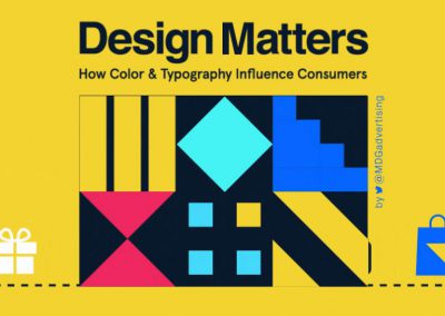
Why Design Matters

I have always loved colour and type. Even when I worked as an editor – where my focus was words – I was particularly interested in the way that design, typography, words and imagery could combine to create an amazing emotional and intellectual response.

Some of my interest here was intuitive, and some was studied. I worked to understand layout. I battled with ugly typefaces. And realised that there really are people who have a much better eye and feel for design than I do. But my efforts provided me with a deep appreciation.

These days, whether we like it or not, all of our work is in sales or marketing. Whether we are communicators, designers, business leaders or just starting out, we are all, always pitching. Always selling. Always communicating.

And with this in mind, it’s important to know a little about how design, colour and type all affect the story you are telling. Even if that story speaks to the unconscious mind of your audiences. This animated infographic from MDG Advertising lets you in on some of the secrets used by professional designers. Pay particular attention to the different ways that men and women react and interpret design and colour. It may just change your day.

Disrupting Graphics: Now Design’s at Your Fingertips with Canva for iPad

Canva-ipad One of the great local startup success stories, Canva – the platform that lets us all create great graphic design in an amazingly simple way – has reached a milestone – 850,000 users. This is no mean feat – especially in a world where every startup, every mature business and hoards of consultants, freelancers and the like vie for our attention, loyalty and share of wallet. With a super-intuitive yet powerful interface, Canva have made it easy for anyone to produce quality graphic design, collateral and presentations.

And by “anyone”, I mean anyone. Including me, my brother and my mother (so yes, it passes the family test). And by “quality” I mean that the results don’t look like they were produced by me, my brother or mother. They look like they’ve been done by a designer. This is largely down to the great library of ready-to-go images, design elements, templates and fonts that come with a Canva account. But it’s also largely by the Canva co-founders keeping a close eye on their advocates, user base and fans.

Speaking with co-founder, Melanie Perkins, over a year ago, it was clear that the Canva team needed to walk a fine line between democratising design – making it available to the masses – while also maintaining the goodwill, support and efforts of the design community. After all, Melanie and co-founder, Cliff Obrecht had come from a design background themselves and were actively working with designers to build out libraries of assets that could be commercialised at scale.

In just over a year, more than 5.7 million designs have been created, Guy Kawasaki has come on-board as chief evangelist, and the team has grown beyond its cute digs in the funky Sydney suburb of Surry Hills.

But not content to rest on their laurels, Canva have now released a new a full function app for the iPad.

And for me, this takes Canva into a whole new market. It puts their powerful platform into the hands of its users. Literally. And that means small business owners. Those who work in shops, restaurants and cafes. It brings ease-of-use to a new level too – with access to your iPad’s camera and camera roll, there’s no more messy transferring of images across devices. It’s all in one place – ready to be edited, filtered and combined with illustrations and images from the Canva library.

Now, I won’t lie. Canva in the hands of a good designer will astound you. And my mum’s birthday card designs, while a big hit with the family, are unlikely to end up being featured in a Hallmark promotion. But Canva is a massive step up from the entry-level tools that still dominate small businesses the world over. So say goodbye to that old Paint program, and say hello to a new universe of creativity. Download Canva for iPad here.

Ash Donaldson – Predicting Irrational Decisions

I don’t know about you, but I am completely logical. Focused. Directed. I am completely in charge of my own decisions and behaviour.

Or so I thought.

A couple of weeks ago, I caught up with Ash Donaldson, caffeine aficionado and behavioural design guru. We got talking about mobile app design and human behaviour and within seconds, my head was swimming. He was connecting dots that once swirled around my head like stars in the night sky. With a few quick examples, he explained how – through design – we can predict someone’s decisions.

And if you are interested in understanding how this might work in practice, take a look at Ash’s webinar on Slideshare. It’s 10 minutes that may just change the way you plan your marketing. And it may just change the way you think about your own choices that you think you make.

MotoCorsa Portland Show Us How to Sell Ducatis

When I sold my last motorbike, I almost cried as its new owner rode into the cold, afternoon sun. Ever since I started riding as a teenager, I had dreamed of owning a Ducati – and here I was, many years on, relinquishing my much-loved Ducati Monster. But once you have owned one Ducati, it’s in your blood.

As a result, I am constantly on the look out for my next (future) bike. Now, this may never eventuate – but most men live under the constant and unyielding delusion that hope springs eternal, and that the old man staring at them in the mirror is some alien imposter. Old Spice got it right – in our mind’s eye, we all look like Isaiah Mustafa. And in my mind, Ducati is the bike that brings that imaginary world to life.

But the marketing of motorcycles is a relatively unadventurous sport. It largely revolves around the big philosophic binaries – sex and death. On the one hand, we know that motorcycling is dangerous, but the experience pushes us closer to the edge of some other form of being. It’s that futurist convergence of man and machine and all the libidinous energy that it can muster. It creates a gravitational pull that draws us in. And motorcycle advertisers play this for all it is worth.

The end result is that what was once James Dean-level thrilling, is now formulaic, with as little as three key narratives played out over and over across any and all brands:

  • The outlaw: you may be have an honest, humble day job, but the moment you throw your leg over your bike, you’ve left that world behind. It’s you, your bike and the open road. And the only thing between you and the future is the aura of danger that emanates from every pore
  • The master blaster: they say that speed kills, but that’s only for novices. What a bike needs is a master – a MotoGP pilot – and under your firm hand, it’s all under control
  • The rear view mirror: motorcycles were part of your youth. But there’s part of your soul that has never changed. And you can recapture that spirit of adventure – in a modern, more comfortable way. [Side note: I’m selling myself in on this narrative alone.]

The visuals for each of these narratives similarly run to a formula. Edgy typography. Short copy. Aggressive, angled photography laced with scantily clad women.

As a result, there is very little that catches my attention. Sure there may be different bikes, different angles – and even different girls. But we’ve seen it all before.

Or have we.

In support of the release of the new Ducati 1199 Panigale, Portland-based Ducati dealer, MotoCorsa decided to mix it up. They started out with the standard girl-on-a-bike. But then they followed it up with another series. This time, the model, Kylie Shea Lewallen, was gone. And in her place was a series of MotoCorsa workshop blokes, striking the same poses with the same great motorbikes.

Brilliant. Fun. And just check out the calves on the guy in heels. Check out the full photoshoot comparison at ashphaltandrubber.com – but be warned, there can be some things that cannot be unseen.

MotoCorsa-seDUCATIve-MANigale-photo-comparison-01

MotoCorsa-seDUCATIve-MANigale-photo-comparison-02

MotoCorsa-seDUCATIve-MANigale-photo-comparison-03

Gustin Shows Why Retailers Still Don’t Get Digital

For years, Australian retailers have under-invested in digital. They held back technology investment, closed down innovation programs and hired traditional marketers when they should have been growing their own breed of tech-savvy innovators. And while retailers had their heads in the sand, the world changed.

Recent failures like ClickFrenzy have been down played and it’s clear that even the retailers with some digital budget are unprepared for the fast moving transformation taking place thanks to mobile.

In spite of all the trends, facts, figures and forecasts, retailers remain unconvinced. What is driving this myopic view of the future of business? In many ways, it feels like a classic illustration of the The Innovator’s Dilemma – companies (and indeed a whole industry) misses out on new waves of innovation because they are unable to capitalise on disruptive technologies.

But I also think retailers are captives of “Big Thinking”. Because they operate at scale, big thinking clouds their judgement. It’s easy to discount competitors when they generate sales that are fractions of a percentage of your business. But it’s not the percentage that’s important, its the velocity and momentum.

Hand made men’s clothing manufacturer, Gustin, illustrate this shift beautifully. They launched a Kickstarter campaign some time ago with the aim of raising $20,000. The premise was simple:

  • Capitalise on their growing brand and reputation for premium menswear hand-crafted in San Francisco
  • Allow for pre-purchasing of products through crowdsourcing – perfectly matching the demand and supply chains
  • Deliver the retail items to customers directly at wholesale price

Now, with two days before the campaign closes, Gustin have massively over-reached their goal. Currently sitting at almost $407,000, Gustin have smashed the target, connecting with almost 4000 new customers and validating not only their approach but also whole product lines.

And all this was done by taking an outside-in view of their business.

Until other retailers can transform the way they think about their business, their customers and the experience they provide, they will continue to struggle with this new world of digital.

Logos and the Psychology of Colour

In the process of building new brands, there are three steps that I love:

  1. Naming: The naming of your new brand can be fraught – but should be fun. Coming up with a name that is descriptive enough for your customers but imaginative enough to draw them in can take far longer than you can imagine. Then once you have a name, securing and registering it can take time and more than a little money. There are some agencies dedicated to naming, and if you have a big budget it would be fabulous to work with them … but if you’re running a startup, chances are you’ll be doing the naming over a few beers with your mates. Be sure to think through the various combinations of the name and how it will be used. After all, you don’t want to follow the example of promo pen company Pen Island.
  2. Planning: No surprise here – but I get quite a kick out of the planning process. From building out the communications architecture through to building out the business case, planning is an important step for any startup. You’ll be amazed what you can learn in a couple of days – and the research and analysis (not to mention the discipline) will hold you in good stead as you start to seek funding and build your core team.
  3. Visual design: Most people think that branding is about logos. A logo is just part of the branding process … but it does need to be given time and attention. And budget always helps. Even if you have budget, it still helps greatly to provide a solid brief to your designer – which is where your planning will help. Make sure you share your research and thinking – explain the various use cases and audiences that your new business will impact. Provide a list of “attributes” that describe your brand. Be clear about the vision you have for the future of your brand. All this information should soak into the appearance of your logo and the visual design of your band.

Now that you have a name, some understanding of the potential of your business and some ideas for your logo, take that list of attributes and find them in the list in this infographic from MuseDesign. Pay special attention to other logos that you see and that you admire. Think about how they are using colour to engage you emotionally. What can you learn from great logos? Which designs make your heart jump?

After all, if you want your brand to be memorable, you’ll need all the branding help you can get.

Influencing Design with Frank Chimero

One of the biggest challenges we face in the business world is – in my opinion – not generating more sales, cutting more costs or improving productivity. It’s more fundamental  and goes to the heart of our human condition. It’s harnessing our logic AND our creativity in such a way that it solves the problems that our work, business, social and creative endeavours throw in our path. I call it The Social Way.

So, the chance to hear Frank Chimero speak in Sydney in June looks too good to pass up. He has worked as a designer, illustrator and strategist for brands such as the New York Times, Facebook and WIRED. His recent book The Shape of Design suggests that logic may not always to be the best way to solve design problems (which obviously is right up my alley) – and his inclusive style promises a lively keynote and Q&A forum.

Here courtesy of Portable and VIVID Ideas, he is also slated for talks in Brisbane and Melbourne. Book in while you can!

Design is Trust – Using the Nine Principles to Change Your Work Practices in Nine Days

I like the central theme running through this presentation by Jason Cranford Teague – trust. And while the focus is on design – mostly web design as it turns out – these nine core principles can so readily be applied to any business or communication challenge. They can be applied to advertising. To social media. To storytelling. To literature.

So as you are browsing through this presentation (and yes, the 100 odd slides will slip by quickly), think about your particular business challenges in light of the nine principles. Consider the changes you need to make in your current work patterns to deliver on each principle. And if you dare to, write down one thing you WILL do for each of the next nine days – taking one  principle per day.

And I’d love it if you’d also go one step further – to write a blog post about what you are doing. Each day. Nine blog posts. You know you can do it.